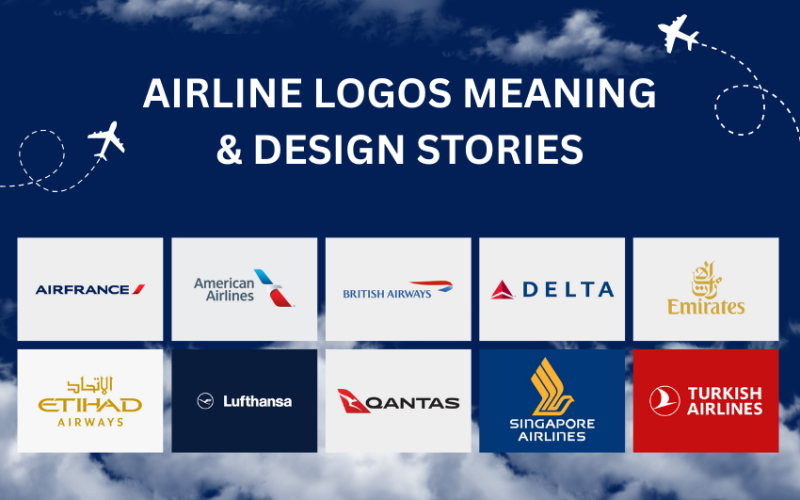
Have you ever looked at an airline logo and felt something? Maybe it gave you a sense of adventure. Or safety. Or a far-off dream waiting to be chased. That’s not by accident. Logos are powerful little things. They tell stories. They show values. They build trust.
In this article, we’ll take a closer look at some of the world’s most well-known airline logos. We’ll explore where they came from, what they mean, and how they’ve changed over time. These aren’t just symbols. They’re pieces of history—flying stories written in color and shape. Let’s take off.
Why Airline Logos Matter
Think about it. You’re at an airport. You see a plane with a bold logo on its tail. Instantly, you know the airline. That’s the power of a logo. It’s a promise. It says, “We’ll get you there safely.” Or, “We’re fun and friendly!” Airlines spend millions to get this right. A logo isn’t just art. It’s identity.
Airlines face unique challenges. Their logos must work on tiny tickets, huge planes, and digital screens. They need to stand out in crowded airports. And they must appeal to people from different cultures. That’s a tall order! Yet, some airlines nail it. Let’s look at ten of the best.
Most Famous Airline Logos: History and Design Stories
Embark on an exciting journey into the field of airline logos where the symbols hold great stories, the history is interesting and the company holds great importance.
American Airlines – The Eagle of Freedom
The American Airlines logo has seen several changes. But one thing has always stayed the same: the proud, bold spirit of America.
Backstory:
Founded in 1930, American Airlines first used a logo that featured an eagle—America’s national bird. Over the decades, the design changed many times, but the eagle remained a constant theme.
Today’s Look:
In 2013, the airline introduced a sleek new logo. It features a red, white, and blue eagle’s beak slicing through the air. It’s modern and clean. But it still feels patriotic. That’s the point. It connects with people who believe in strength, flight, and national pride.
Fun Fact:
The redesign in 2013 was part of a $1 billion brand overhaul.
Lufthansa – The Flying Crane
This German airline has one of the oldest logos still in use today. And it’s simple: a crane in flight, inside a circle.
Backstory:
Lufthansa’s crane was first drawn in 1918 by a German graphic artist named Otto Firle. It represented grace and technical precision. After some changes over the years, the airline went back to this original design. It’s now a clean white crane inside a dark blue circle.
Why It Works:
Cranes are birds that travel long distances. They fly high and far. Just like Lufthansa. The circle adds balance and unity.
Did You Know?
Even during World War II and post-war chaos, the crane remained a steady part of Lufthansa’s identity. That says a lot about how much they value tradition.
Emirates – Elegance in Arabic Script
If logos could speak, Emirates would speak in Arabic with class and confidence.
Design Feel:
The logo is simple. Just the word “Emirates” in English and Arabic. But it’s the stylized Arabic script that stands out. It’s elegant, flowing, and bold. A perfect reflection of the airline’s image—luxurious and global.
The Meaning Behind It:
The choice to keep the logo word-based (instead of using a symbol) says a lot. It shows pride in language and culture. And it leans on the strength of the brand name.
Color Talk:
The red color represents energy, power, and hospitality. All things the airline wants to be known for.
Qantas – The Flying Kangaroo
If you’ve ever flown to or from Australia, you’ve likely seen the hopping kangaroo on a tail fin.
Where It Started:
Qantas began using the kangaroo in 1944. Why a kangaroo? Because it’s a symbol of Australia—and because kangaroos can’t go backward. That’s right. It’s a nod to always moving forward.
Logo Changes:
Over the years, the kangaroo has gone from looking hand-drawn to a sharp, modern icon. In 2007, a more stylized version appeared. It’s smooth and fast-looking, giving the sense of motion and flight.
Key Message:
The kangaroo isn’t just cute. It’s a powerful image of national pride and forward-thinking progress.
British Airways – The Speedmarque
British Airways’ current logo may not have a bird or an animal, but it still screams flight.
Design Elements:
The main part of the logo is the “Speedmarque”—a red and blue ribbon that swoops upward. Next to it is the airline’s name in a bold, classy font.
Why It Matters:
This logo came in the late 1990s. British Airways wanted to look more modern and global. The Speedmarque gave the feeling of movement and energy.
Colors:
Red, white, and blue. A clear connection to the UK flag, and a reminder of national pride.
Then vs. Now:
Earlier logos featured a coat of arms and even a lion. But those looked formal. The new one feels smooth and inviting. Less royal. More ready-for-takeoff.
Singapore Airlines – The Bird of Luxury
Singapore Airlines’ logo might be one of the most elegant in the sky.
The Symbol:
It features a bird inspired by a silver kris—a traditional Malay dagger. The bird shape formed from the dagger represents speed, power, and heritage.
Why It’s Unique:
This isn’t a real bird. It’s a stylized idea. It blends local tradition with international class. That’s exactly what Singapore Airlines is known for—top-tier service with Southeast Asian roots.
Design Notes:
Gold and navy blue are the colors of choice. They bring to mind luxury, trust, and excellence.
Delta Airlines – The Red Widget
Delta’s logo is simple. But it packs a punch.
Look Closer:
At first glance, it looks like a red triangle. But look again, and you’ll see a clever 3D shape. It’s called the “widget.”
Meaning:
The widget points upward—like a plane taking off. It represents strength and motion. And the color red adds energy.
Back in Time:
Delta has used some version of the widget since the 1950s. It’s clean. Timeless. Easy to spot from far away.
Bottom Line:
This logo proves that simple can be strong.
Air France – A Stripe with Style
Air France has kept it minimal over the years, focusing more on class than flash.
Design:
The current logo features a sleek red stripe next to the airline’s name. That’s it. But the typography and colors scream style.
Backstory:
The red stripe is actually a nod to the tricolor French flag—blue, white, and red. But done in a modern, abstract way.
Personality:
The logo feels smooth, like a luxury brand. It doesn’t need an image or a bird. The name and style do all the talking.
Turkish Airlines – The Wild Goose in Flight
Turkish Airlines features a white wild goose flying inside a red circle.
Why a Goose?
Because geese are strong flyers. They travel long distances across the world—just like the airline. And they’re graceful in the air.
Symbolism:
The red circle reflects the Turkish flag. The bird suggests freedom, discovery, and international travel.
Fun Insight:
This logo gives both national and global vibes. It’s one of the few logos that looks just as good in digital spaces as it does on the side of a plane.
Etihad Airways – Arabic Elegance in Gold
Etihad’s logo is about luxury, tradition, and beauty.
Design:
The word “Etihad” is written in both English and Arabic. The fonts are carefully chosen. They feel premium. And the gold color adds richness.
Message:
This logo doesn’t shout. It whispers class. It speaks to travelers who want something more refined.
Meaning Behind the Name:
“Etihad” means “union” in Arabic. The logo brings together tradition and modernity in a balanced way.
What Makes These Logos Great?
Look at these logos. What do they have in common? Simplicity. Emotion. Versatility. A great airline logo isn’t busy. It’s clean and clear. It tells a story—about a country, a culture, or a promise. And it works everywhere, from a tiny app icon to a massive plane.
These logos also evolve. Airlines tweak them to stay fresh. But they keep the heart of the design. That’s why we recognize them instantly. They feel like old friends.
Final Thoughts
Airline logos are more than just fancy designs. They’re full of meaning. They tell stories of culture, pride, history, and dreams. When you look at a tail fin next time at the airport, take a second to really see it. Behind every curve, color, and line, there’s a message. A memory. A mission.
From cranes to kangaroos, from crowns to calligraphy—every logo we’ve covered has a purpose. They’re not just for looks. They fly alongside the planes. Quietly. Proudly. Telling the world who they are and where they come from.

